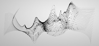
the art of data visualization
The video began with the quote said by Edward Tufte, "every single pixel should testify directly to content." He is saying that a picture is made up of an abundant number of pixels and each pixel is significant because it directly contributes to the overall image. The overall image, song, painting, sculpture, or other work of art is about how the viewer perceives or connects to the content on some level. The way the content looks means nothing if there is no true meaning behind it. The purpose or meaning of the content is different for everyone whether it is the artist or the viewers.
Data visualization is used in our everyday lives, and most of the time we don't realize it. For example, maps are a form of data visualization and we put it to use for the purpose of finding a location or destination and getting from one place to another. From paper maps to digital maps, it is evident that data visualization has evolved overtime to keep up with the generation that we live in. "The history of visualizing data is the history of science," Tufte states. I experience the truth of this in my own life. In Bio lab, we are often told to draw what we sees under the microscope so that we can identify certain structures of the organisms we are looking at. This helps us as students to learn through visualization. This is helpful to me because I am a visual learner.
The woman in the video, Julie Steele, spoke about how there are three things that should inform your design always. The first is the artist or designer. As the artist, you should be able to inform your viewers of the message that you are trying to convey with your content. The second is the viewer. The viewers will have questions and opinions of their own and it is the artist's responsibility to provoke thoughts from the viewers. The third is the data itself. The data should be able to speak for itself, which is easier said than done because people have different perceptions of the same thing due to the complexity and uniqueness of the human mind.


Comments
Post a Comment